RICHMOND, Va. -- When talking Penguins rivals, the familiar names always come up … the Flyers, the Rangers, sometimes even the Capitals, if you can call something so historically one-sided a rivalry.
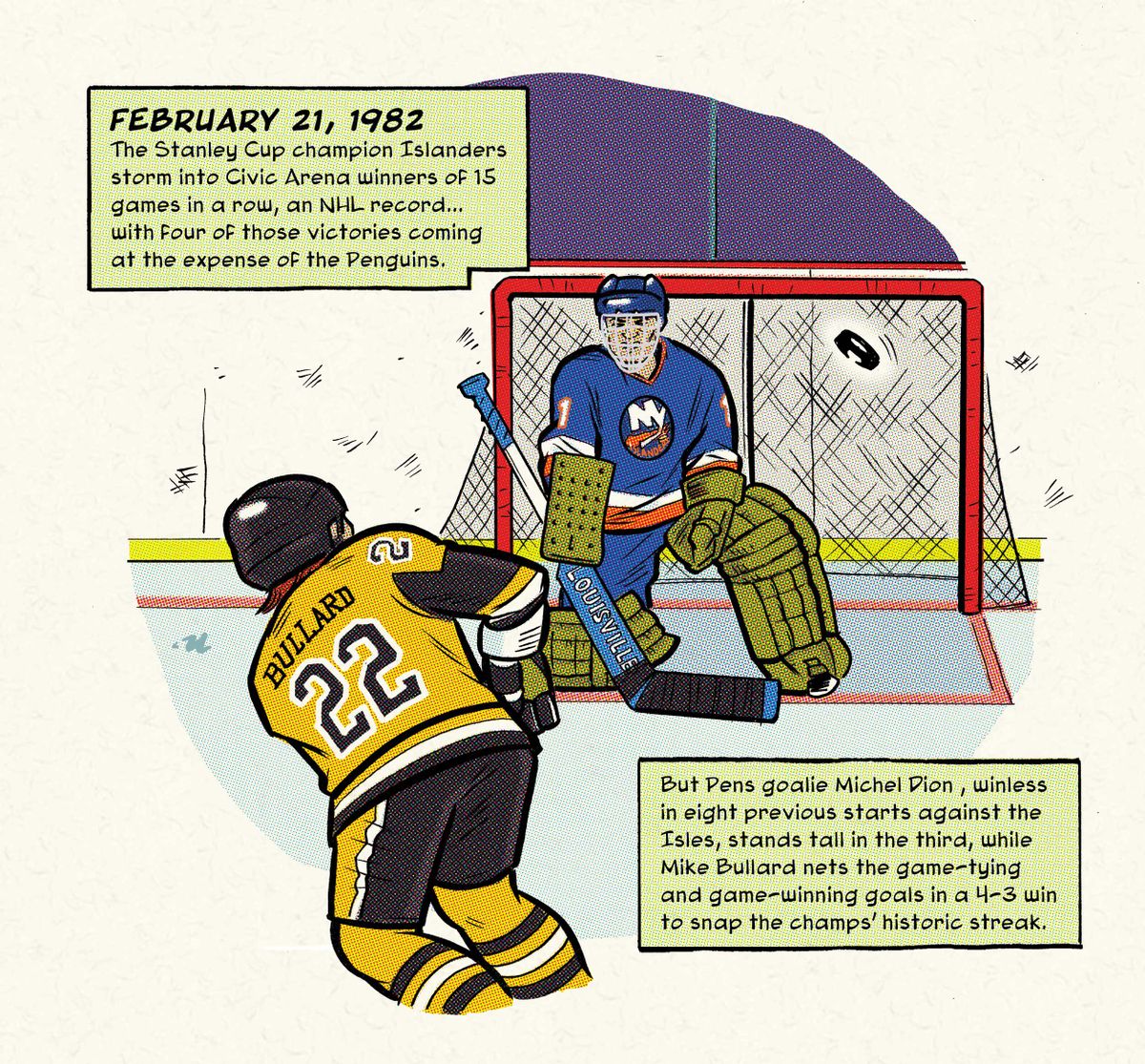
But for my money, there are few teams that stick in my craw like the stinkin’ Islanders. Outside of a half-dozen insanely dominant years, the Isles have mostly been mediocre at best, but their presence in a big matchup always seems to inspire the Pens to lay eggs rather than score goals, whether it’s 1975, 1982, 1993 or 2021 … or Friday night.
There’s also that logo, which I have never liked, looking like it was designed in MS Paint at the last minute. There’s some old-timey charm to it, sure. But when stacked against the truly clever logos of the same era, such as the Whalers, Nordiques or Flames (Calgary or Atlanta), it falls miserably short. They can never change it, either, tied as it is to the early-80s dynasty. Almost makes one glad the Pens never won a cup sporting the corporate pigeon, doesn’t it?
(No, it doesn’t.)
ROB ULLMAN / DKPS
For prints and books, visit my site and/or the new DK Pittsburgh Sports HQ/shop at 224 Fifth Avenue, Downtown!