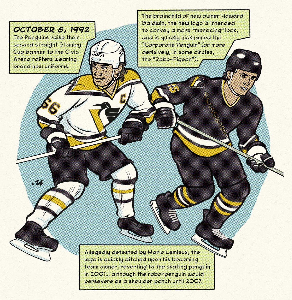
RICHMOND, Va. -- Ah, the Robo-Penguin. It finally made it’s long-awaited (or long-dreaded?) return this week as a part of the 2022-23 Reverse Retro series. I kinda grew up with this logo and uniform, and although I always liked it just because it was the logo for my favorite team, I always pined for a return to the original skating penguin. It’s strange to think about just how short-lived it was, only nine years…perhaps because those same nine years overlapped with my 20’s, it seems like they wore it a lot longer!
As far as the new jersey goes, I’m kind of surprised about how indifferent I am about it. It’s… fine. Another black jersey. Ho hum. The design it’s modeled after, the 1992-2001 home whites, is a very good-looking jersey… I always liked the sharp point of the shoulder yoke and stripes…but the effect is lost with the colors reversed. And of course, the look every robo-penguin obsessed fan seemed to want was the gradient-heavy third jersey, introduced in 1996. I’ve never really cared for that one all that much, but for a program like Reverse Retro, I kinda wish they’d used tit as a starting point and swung for the fences, and came up with something so fantastic/monstrous that you’d have no choice but develop a strong opinion about it!
ROB ULLMAN / DKPS
For prints and books, visit my site and/or the new DK Pittsburgh Sports HQ/shop at 224 Fifth Avenue, Downtown!
